
Gieo Nhớ
Healing Spa
Brand Experience & Graphic Design
Designed to be felt. Made to be remembered.
A little care, a lasting memory.
- Client
- Gieo Nhớ Healing Spa
Ho Chi Minh City - Industry
- Wellness & beauty
- My role
- Visual direction & brand applications
Graphic design
Print & marketing collateral
Product packaging design
Service menu design
Social media design - Logo
- Supplied by the client
The name Gieo Nhớ means “to sow a memory”. This small Vietnamese healing spa is built on the belief that care goes beyond the body. It is a quiet place to pause, put down the day’s worries and come back to yourself.
The spa already had its logo. My work was everything around it: a visual direction that carries the same gentleness into every piece a guest holds, from the first voucher to the bag they take home.
- Gentleness
- Warmth
- Emotional connection
- Small gestures of care
More than a place to relax.
Có những lúc, con người ta không cần gì hơn ngoài một nơi để thở.
- Một góc nhỏ… để dừng lại.A small corner, to stop for a while.
- Một đôi tay… để chạm vào những mỏi mệt không ai thấy.A pair of hands, for the tiredness no one else sees.
- Một khoảng không… để nghe chính lòng mình nói điều gì đó đã rất lâu rồi chưa được thốt ra.A quiet space, to hear your own heart say what it has kept unsaid for a long time.
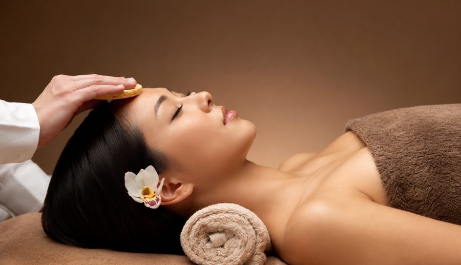
Warmth in every detail.
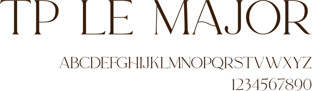
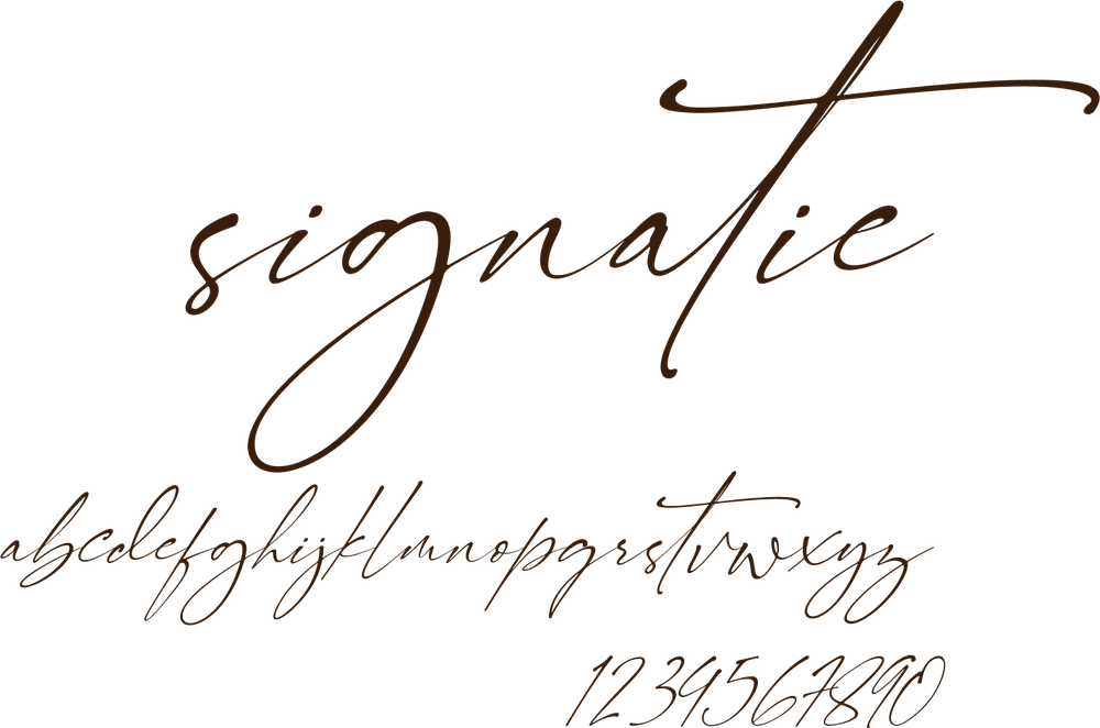
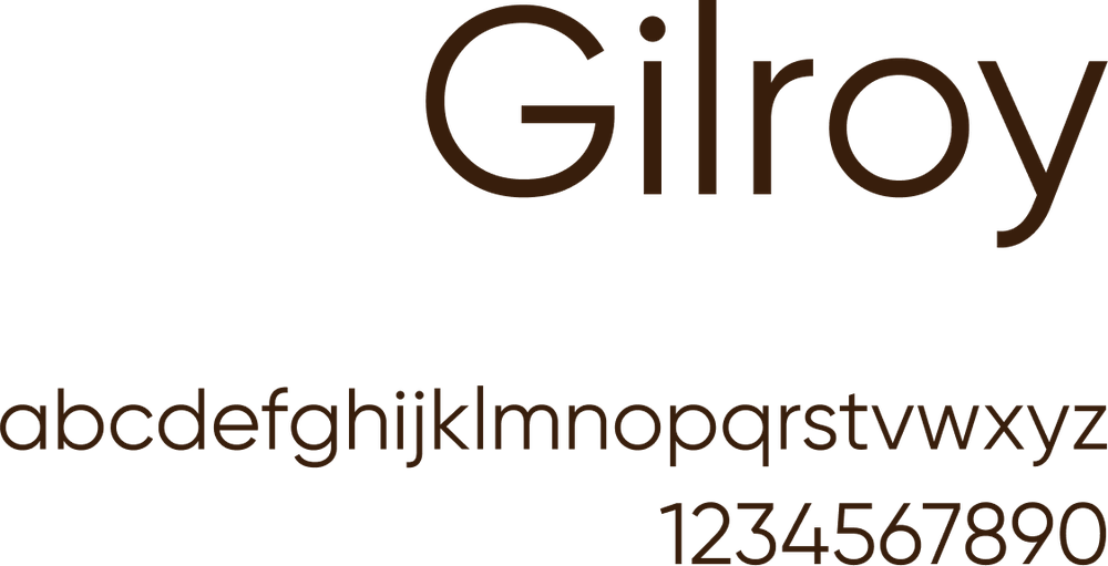
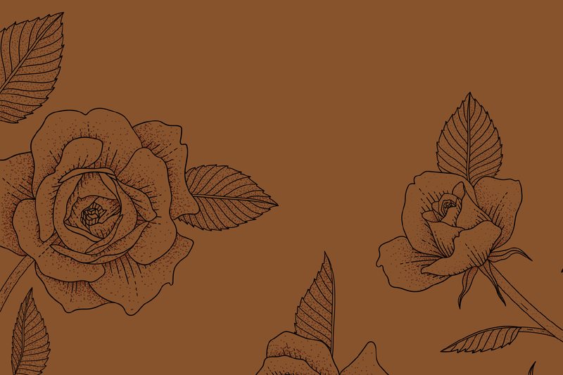
Nothing in the system is loud. Three typefaces, line-drawn roses, kraft paper and a warm palette carry it from a business card to a full-height standee.
- Deep brown#87532C
- Terracotta#C57B4D
- Kraft#C3A07A
- Cream#F4E1D0
- Olive green#495F22
- Forest green#223221
Small gestures,
lasting impressions.
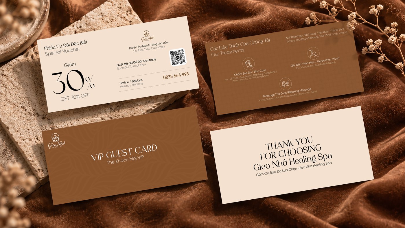
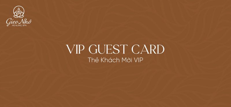
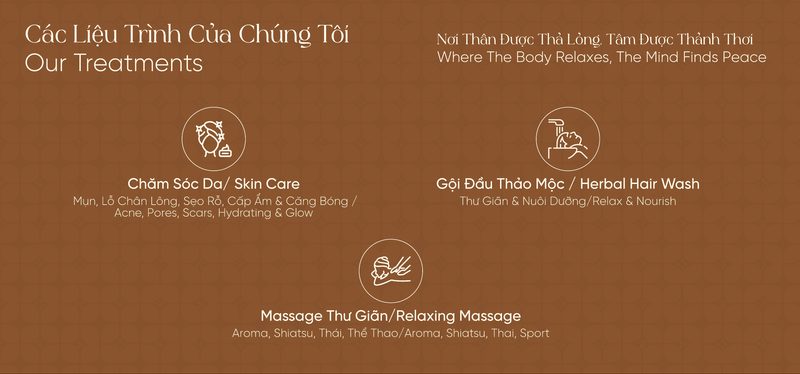
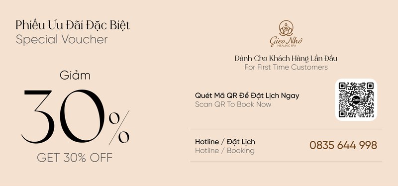
Vouchers & guest cards
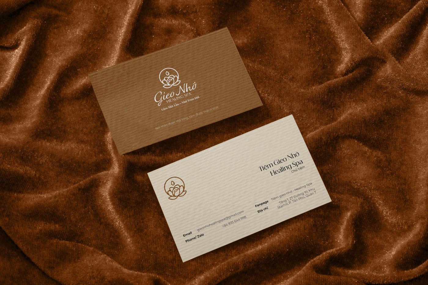
Cream and deep brown alternate across the cards, tying the set together.
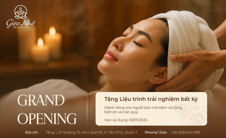
Grand opening
A gift card offering a free treatment “to the friends the spa is truly grateful to”.
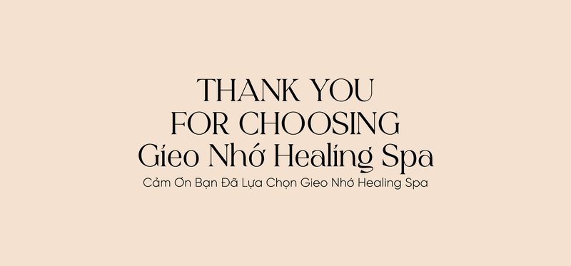
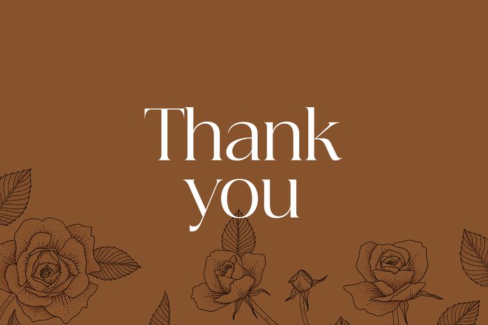
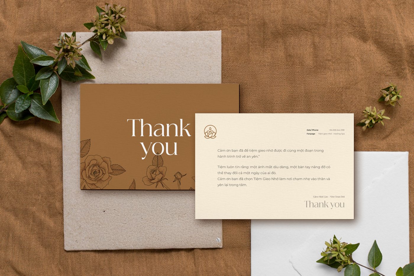
Thank-you letter
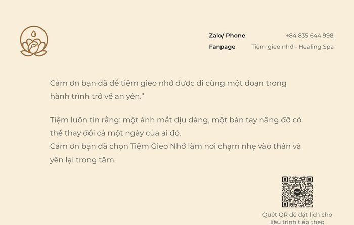
“Cảm ơn bạn đã để tiệm gieo nhớ được đi cùng một đoạn trong hành trình trở về an yên.”
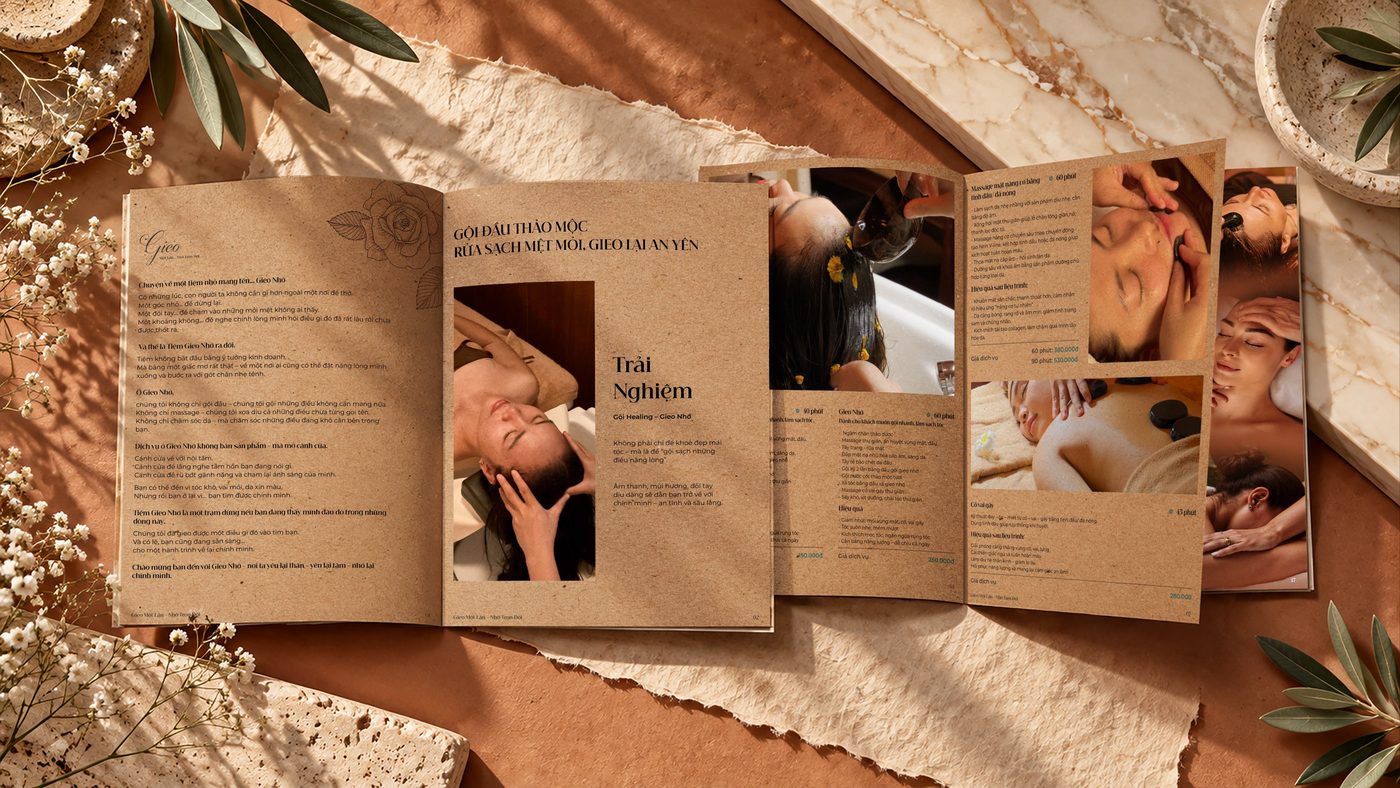
Care beyond the treatment.
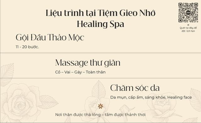
What guests read before they choose, and what they take home. The same paper, the same roses, the same quiet.
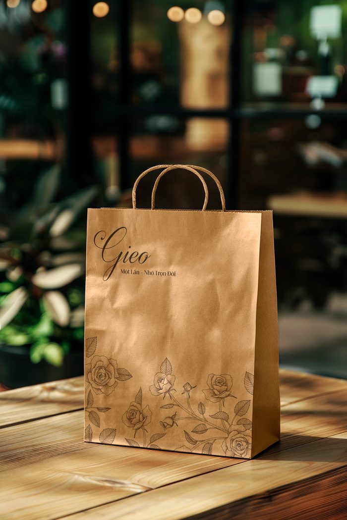
Kraft bag
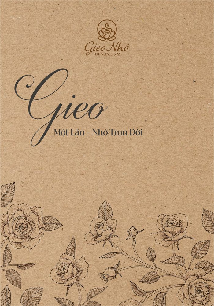
The script word Gieo, “to sow”, sits with the line Một Lần – Nhớ Trọn Đời and a border of roses. From flat artwork to the finished bag.
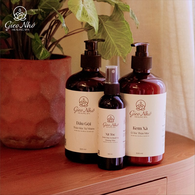
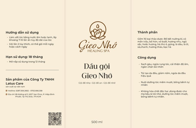
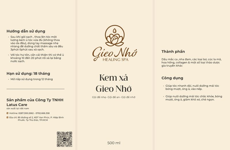
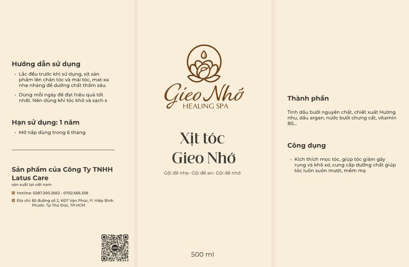
Herbal haircare
Shampoo, conditioner and hair spray share one wrap-around label: directions on one side, the mark and the name on the front, ingredients and benefits on the other.
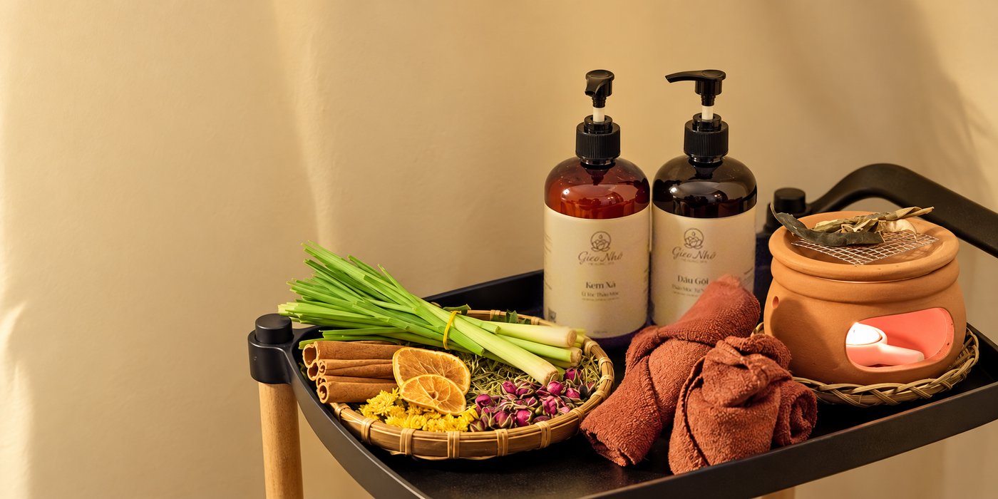
The brand in everyday life.
Each format keeps its own shape; the voice stays the same.
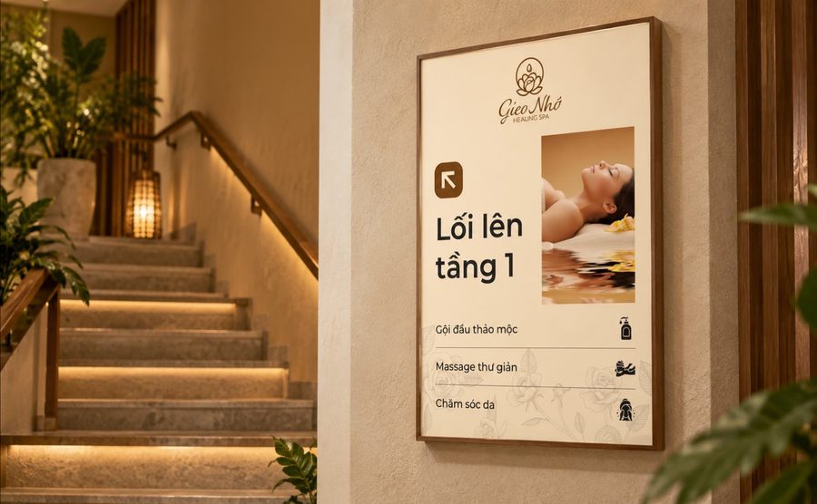
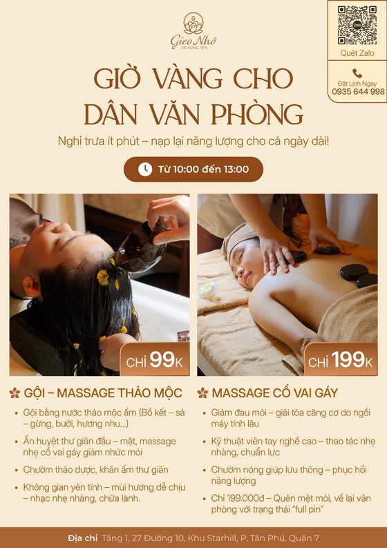
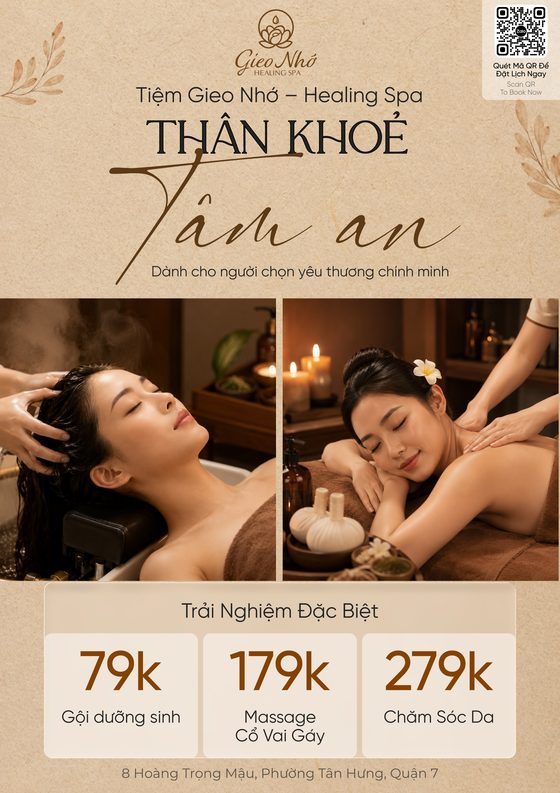
In-store & print
A wayfinding sign for the stairs, posters for the walls and standees for the door.
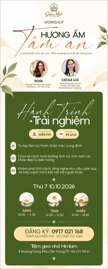
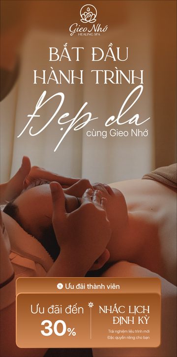
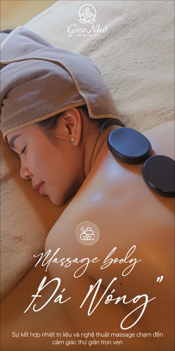
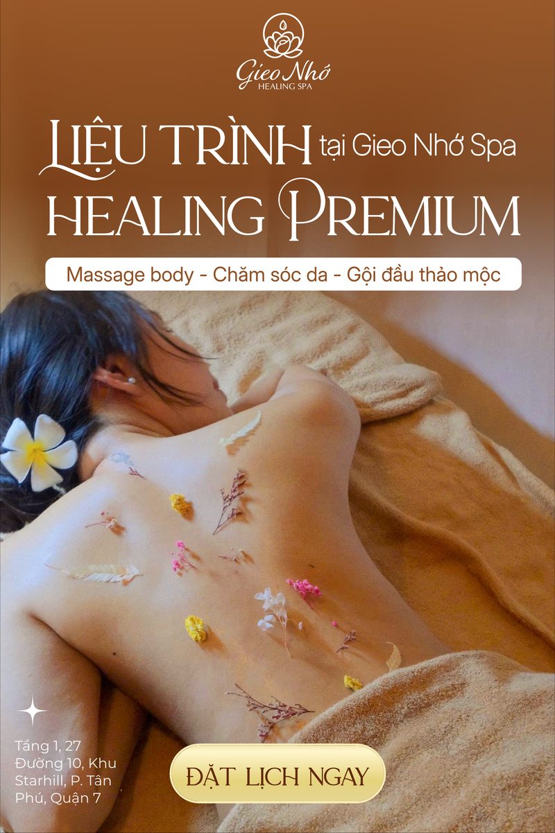
Social media
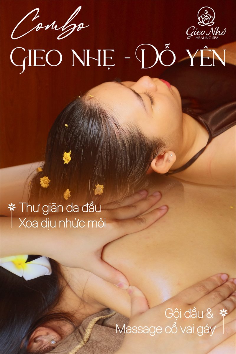
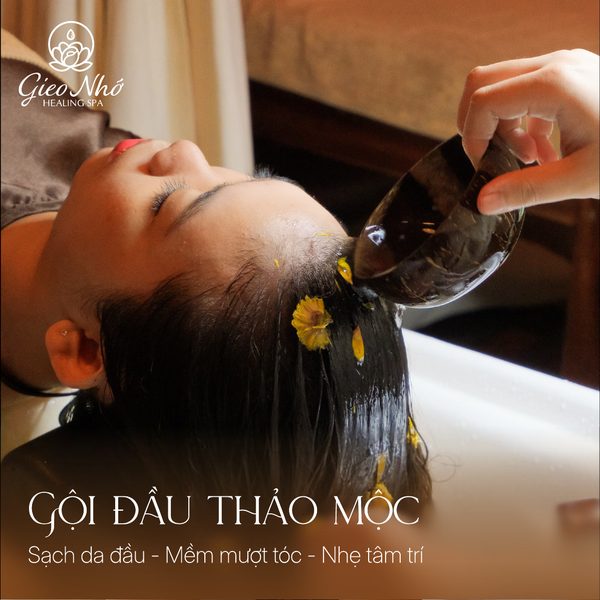
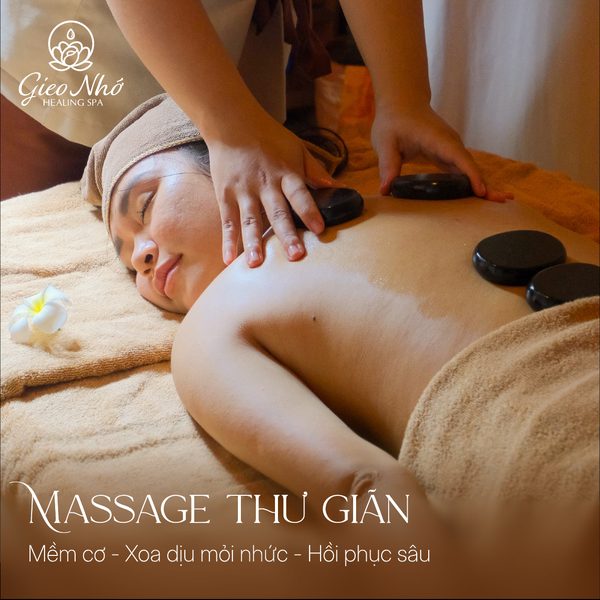
Portrait posts for campaigns, squares for single treatments. Warm photography, the serif headline and the mark in the corner.
Made to be remembered.
Gieo Một Lần
Nhớ Trọn Đời.
Sow once, remember for a lifetime.